A great website is so much more than one that’s free of clutter. Effective design goes beyond customers knowing you have a discount running, or merely listing every service you offer.
A great website is streamlined, professionally built and designed, pleasing to look at, and SEO-friendly. And effective SEO isn’t restricted to the blogs you create for your website either; it extends to the website at large. But how do you make your website SEO-friendly? Do you add keywords to the copy? Do you add CTAs? Or is there more to website SEO than meets the eye?
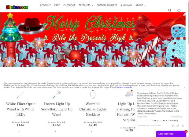
Before we begin, let’s have a look at the landing pages of two different websites. Here’s the first one.

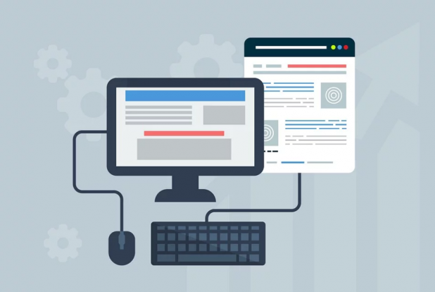
And here’s the second:

It doesn’t take rocket science to understand which one has more of a chance to rope in and retain prospective customers.
The first is clunky, full of gaudy colors and bad color combinations, uses several kinds of fonts, employs absolutely bizarre imagery, and has a sizeable amount of text that can’t be read.
Even though they do get some things right—such as a live chat option with a very catchy slogan (Chat with Matt) and they do have pricing info for their products, there’s nothing else to write home about.
Their navigation banner clearly shows that they have a separate page for their products, and yet, they show up on their home page as well. They’re also still pushing a Christmas offer when the holiday season ended quite some time ago; this indicates that they aren’t too serious about updating their website on a regular basis. Their content is also poorly written—so on and so forth.
The second, however, does things quite differently. It has one big banner image that’s clear and high-quality. Their slogan is readable. The color combination works for them, and the sparsity of text makes for good design. The website stands out—but why?
What Makes a Website Stand Out?

It isn’t just your products and services that make you appealing to prospective customers and online shoppers. It isn’t just your promotions and discounts either.
Your website is potential customers’ first channel of exposure, and smart business owners know they need to nail web design if they’re serious about succeeding in the long-term with savvy online shoppers—which is what makes up the future consumer pool.
Established businesses and reputable brand names keep up with the latest in web design, and stay busy targeting these trends all-year-round. But it’s not established businesses with mature websites that need to pay attention to web designs; it’s small businesses and startup gigs—especially those in big cities with tons of competition to go up against.
The U.S. Small Business Administration reports that more than half of all American citizens have a small business. Small businesses amount for 2 in every 3 jobs in the U.S. Clearly, small businesses are big; but there’s a catch: there are just too many of them. And whenever there’s too much of something, you need to stand out to have a shot at even being noticed.
There isn’t one thing you can do to make your website look immediately better than your rivals’. From listing your social media accounts to using the right images and employing great JavaScript code, the list is long.
Here are seven things you should look out for:
1. List Your Social Media Accounts

Millennials aren’t the only group that loves social media. Search engines rely on social media too, and they’d love it if you list your social media accounts on your website. More than that, add backlinks to them, and include recognizable icons alongside.
Make sure you’re going for the most popular social media channels, such as Twitter, Facebook, and Instagram. Other channels—such as LinkedIn and Pinterest—work as well.
But keep away from lesser known social media websites such as Chirp or Medium, or anything that prospective customers might never have heard of.
Listing your social media accounts gives your business a more personable aura.
2. Using the Right Images
SEO isn’t just about content. It’s for images too. Optimized images automatically improve your SERP rankings. Images shouldn’t be too large because huge images slow your website down.
If you’re adding text with the image, select a keyword. And add relevant images that look like they belong on the site.
3. Proper Use of JavaScript

Often, web designers go with JavaScript for the entire website. This is a mistake. Search engines will crawl through the website before it can be indexed.
A website that’s loaded with JavaScript becomes difficult to read for them. JavaScript also doesn’t work terribly well on smart phones. Remember, you’re looking for simplicity and ease of use—and excess JavaScript won’t make your website very user-friendly. So use it sparingly.
4. The Keywords
No talk about websites and SEO is ever complete without some mention of keywords. Keywords are important all-round, and not just where it concerns content.
Incorporate keywords into every aspect of web design—such as optimized images, in the titles, in the H1 and H3 tags, in the meta descriptions and slogans, in your CTA, in the footer and navigation banner, and even in the URL.
5. The URL
How can SEO make sure your website’s URL appears in the first results when a prospective customer is Googling for something you sell?
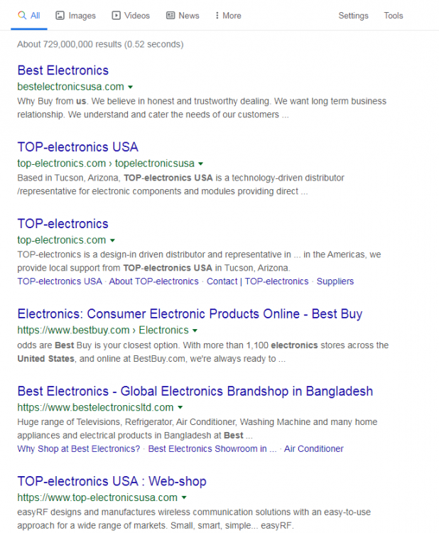
Here’s an example of how that works:

If a prospective customer is looking for electronics and types in “best electronics” in their Google search bar, these results will show up.
Focus on the URLs here—all of them contain the keywords top electronics/best electronics/buy best electronics, etc. So optimize your URLs based on your business.
If you already have an established business, you may want to buy an alternative URL that redirects to your website.
6. Don’t be Noisy
While having a chat bot appear after a visitor has spent some minutes on your website is fine, an intervention that’s too glaring can be very distracting.
Excessive flashing elements will make visitors annoyed and will lead to people moving on from your website. This will have a detrimental effect on your bounce rate.
7. Accessible Design
It’s important to note that people aren’t just sticking to desktops for online shopping or browsing anymore. Desktops are used alongside smartphones and apps.
Your website, therefore, needs to be optimized for both. This doesn’t just mean your website should be mobile-friendly. It means that your website should run just as efficiently on a smart phone as it does on a desktop.
Why is Good Website Design So Important?

Psychology Today has weighed in on what is called online persuasion. They found that everything from background images to the color scheme on websites plays a role in a prospective shopper’s decision-making process.
The reason for this is the fact that we might think we’re making rational decisions when we’re shopping online, but our subconscious also plays a huge role.
Take McDonald’s, for instance, with its recognizable red and yellow Pied-Piper colors. The colors work because they have the desired effect on prospective customers: red triggers appetite and yellow triggers joy.
Website design affects purchase intent when it comes to online shopping because the more streamlined a website’s design, the more trust it generates in viewers. A professional-looking, readable, well-built website that doesn’t take more than two seconds to go from one page to another will have a positive effect on viewers, showing them that you’re serious about your business.
Website optimization, accessible and aesthetically pleasing design, and SEO-friendly practices will instantly help your website stand out from the crowd.
With professional SEO services Seattle and a sound business strategy to fall back on, you’re well on your way toward easy success.


