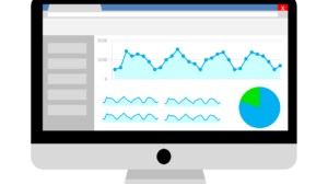
Data visualisation is a graphical representation of information and data. The data that is captured can be visualised using graphics such as graphs, maps and charts that provide an easy and accessible way to see and understand trends and patterns in data, allowing businesses to visually outline dips and peaks.
Psychology states that our minds are drawn to colours and patterns, which is why data visualisation can be a powerful tool for businesses of any size.
Data has increasingly become the central currency for contemporary marketing practices by which value-added content is traded. Companies are built with the ability to create representative stories which are backed by compelling data.
Presenting Data in Content Marketing
Data can be visually displayed and presented in numerous ways through mediums such as infographics, timelines, maps, charts, and graphs. The method you choose for presentation will be based upon the type of data. Which is why it is essential to keep some of the following in mind.
Context – when marketing your data visually it’s essential to think about the information you are sharing. If you remove a large part of the background story, will the reader still be able to understand it fully? Your readers should be able to understand how the data is relevant even if they come across the graphic alone.
Design – for your audience to get the most out of your visual data, keep the design simple. It’s worth keeping related points together. Data that needs to be emphasised should stand out by using contrasting colours. Numbers should be rounded so they are more visible while the text should be minimised to allow the reader to absorb the information faster. It’s also worth ensuring you add your company logo and information to spread brand awareness through social channels.
Actionability – when used alone, data visualisation should prompt and convey an action for your reader. Without action, the presentation of data is useless, and so it is crucial that the information you are presenting is actionable – value-added is value back.
Use Data Visualization to Attract, Not Convert
Although data may be presented in the form of graphs and charts, it will not work for you if your visual content is behind landing pages and hidden behind other pieces of content. Your visual data should help enhance your written marketing content to help draw attention. Visual content is more viral in the online environment. Visual content should lure your readers into the written material, converting to a lead.
Data Visualization Tools
With the number of tools available to us today, data visualisation need not be so hard. Here is a list of user-friendly tools which are available online where you can easily design data-inspired graphics.
Google Charts: create embeddable charts and data graphics for your website.
Excel or Google Sheets: generate graphics and charts for your content. It’s great for charts, timelines, and graphs.
Piktochart: a fantastic tool to make bright, eye-catching infographics which are fun and easy to create.
PoweredTemplate: a tool for downloading pre-made presentation templates, diagrams and charts
Canva: create engaging infographics, charts, tables and graphs
Tell a story
Telling a story with data transforms it from information to meaningful and memorable facts. Data visualisation can help you determine the story, but you have to know your target audience.
Knowing who you are writing for can make your story more impactful and will convey your content marketing message clearer. The story will resonate with them, and you will be able to highlight in your visual content the areas that you know will interest them the most.
Data Accuracy
The most important thing to remember when using data for your content marketing is to ensure it is accurate. If you are using data generated by a third party, make sure it is reputable and trustworthy. If your data is obtained internally, make sure you evaluate and construct it carefully as incorrect data could make your brand look like it’s trying to falsify data for its own benefit, putting your audience off interacting with you.
Overall, data visualisation can be an excellent asset for marketers to utilise in their content marketing strategy and when executed correctly, the effects can positively lift the company.


