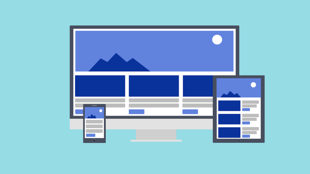
A mobile-friendly website is more than just filling the screen of a smartphone or a tablet. Apart from looking good, it should function great regardless of device size. For example, it should be quick to load and readable as well. Therefore, it takes a lot to design a mobile-friendly website.
To make your work easier, here are the things you should consider in designing a mobile-friendly website that can live up to the expectations of users.
Put the User Experience First
First of all, think about your users. How can your website help them? What are their goals? Can they easily navigate the site over their smartphone?
After all, the main objective of your website is to enhance the user experience of your visitors. It will help them explore your website without annoyance or frustration. There are specific aspects of a web design that should be optimized for various screen sizes. For example, text can look different on a cell phone screen than on a desktop. If it is not optimized, users may have to zoom in to view a website with smaller fonts. Needless to say, it will ruin their experience. Taking note of the mobile websites of your closest competitors can help.
Incorporate a Viewport Meta Tag
The viewport determines how content is scaled or sized over the screen. Simply put, it helps control the layout of a website on multiple devices. Without a viewport meta tag, the content will be “compressed” by a mobile device so that it can fit into the screen’s dimensions. It means that one has to pinch and zoom to see things on the page.
The viewport meta tag prompts a mobile browser to fit the page to the screen. And it is easy to apply. Just paste this code into the HTML code for each page.
<meta name=”viewport” content=”width=device-width, initial-scale=1″>
Design for “Thumbs”
According to this concept, the site should be completely navigable with one thumb without requiring pinching. This is also known as the thumb zone. No matter how a user holds their phone, it helps users navigate, tapping or swiping a site with their “phone hand” without requiring the use of a second hand.
Thumb zone covers the three areas on the screen—easy to reach, hard to reach and neutral areas. For example, bottom center is an easy to reach area. Therefore, place your calls to action and static menus in this area.
Keep the Fonts and Buttons in Right Sizes
Font size and button sizes should be taken seriously (as I mentioned earlier things look different on smaller screens.)
Font size should be set between 14 px and 16 px. While that may seem big, it makes it easy for users to read without zooming in on the screen.
The minimum size can be 12 px which can be used on labels or forms.
CTA Buttons or important icons should be bigger. Bigger buttons are easily noticed and may encourage visitors to take action.
Make it Mobile-First, Not Just Responsive
Contrary to popular belief, mobile-first and mobile responsive designs are not the same thing. While both concepts require a website to fit the screen, there is a huge difference. For example, a responsive website will be resized as it appears on mobile phone screens. Just minimize your existing window and you can see how it will look in various screen sizes. The responsive design just rearranges things so that user can read it more easily. However, its elements like navigation, content, and speed are geared more for the desktop version of your website.
A mobile first website, as the name implies, is primarily designed for mobile phone screens. From rich content and easy navigation to fast loading speed, the whole design of a mobile-first website is made to provide an outstanding mobile user experience.
Choose a Simple Design
Bear in mind that simplicity is a lifeline for a mobile-friendly website. This is because smaller screens lack the space to house everything appropriately. Too many graphics, texts, and flashy animations will make it look cluttered.Moreover, they can hinder the site’s ability to load quickly. Always keep in mind important things about product design, if you want to aim for a clean design that can be aligned with focused content.
Test it More Often
Most designers test a mobile site once it is made. However, testing the site during the development phase can help you eliminate errors that could be a hassle in the final stages or after launch. And a prototype tool can help you with that. With such a tool, you can determine the functionality and appearance of your mobile site. It’s just like taking a car for a test drive.
Once the website is completed, constantly test it out yourself on a mobile device. Google’s Mobile-Friendly Test tool helps you know if the site is working on all devices. However, humans are a better judge than automated tools; so trust the feedback and views of your team.
To conclude, you need to work on elements like user experience, performance, device adaptability, and appearance to come up with a great mobile-friendly website. But the work does not end there. Always follow the current mobile web design trends to stay proactive. All the best!!!


